Remembering Charles Lisanby
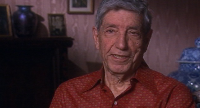

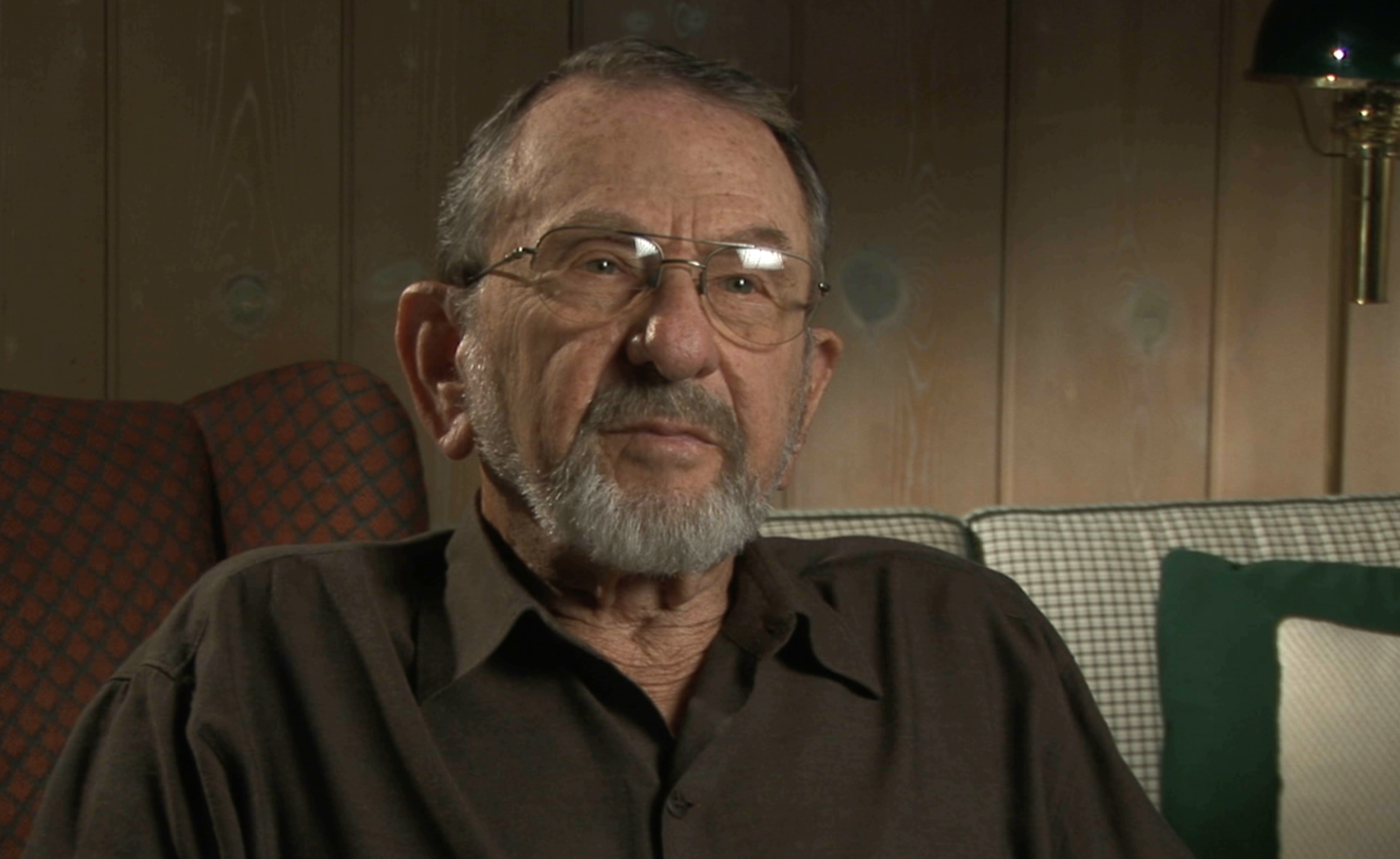
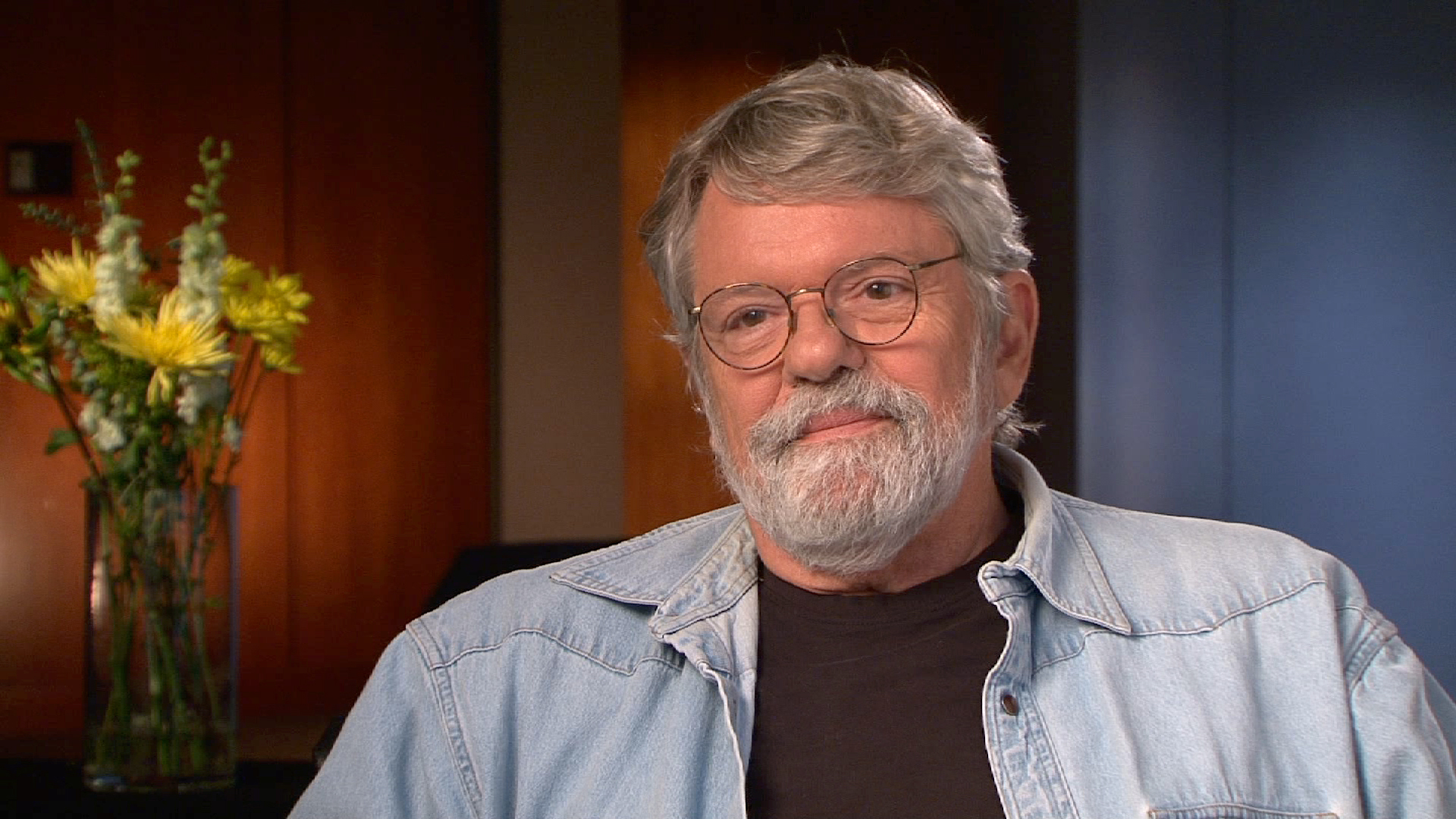
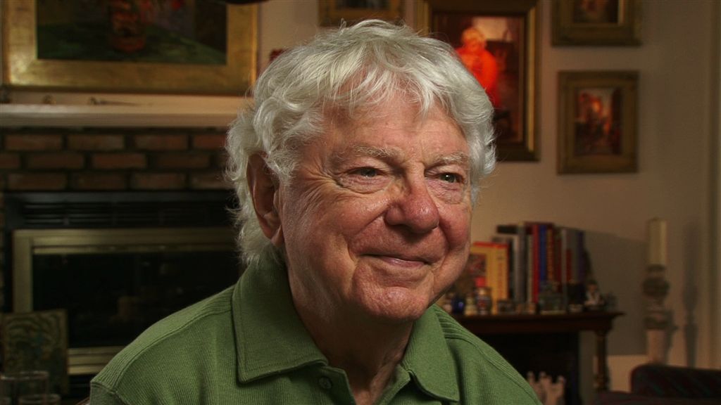
The Archive is sad to hear of the passing of Production Designer Charles Lisanby, who died Friday, August 23, 2013 at the age of 89. Lisanby worked on The $64,000 Challenge and the cultural series Camera Three, designed sets for The Garry Moore Show, and is known for his signature large block lettering - he's responsible for Robert Indiana's "LOVE" on Kraft Music Hall and the word "SMILE" as a backdrop to the Candid Camera set. He pioneered the use of lights on the risers of steps and the use of neon on television (initially on the Emmy Awards), and won his first Emmy for production design on the 1974 Benjamin Franklin miniseries. Lisanby also served as the principal designer at Radio City Music Hall for many years and was inducted into The Academy of Television Arts & Sciences Hall of Fame in 2010.
Below are some selections from his 2007 Archive interview:
On his early interest in design and painting:
Even more specific to the design, when I was ten there was an article in a magazine about Radio City Music Hall - plans of the stage, the great curve proscenium arch, the conjure curtain, the turntable - and I built a scale model of the stage. And I used to listen to the opera every Saturday afternoon broadcast from the Metropolitan and while I was listening to it I would design the set and make it out of paper. If it was Lohengrin it was a medieval castle and if it was Madame Butterfly it was Japanese screens. But I loved the opera and I loved making the models for the scenery.
On working on The Garry Moore Show:
I showed one sketch to Bob Banner, which fascinated him. It was a sketch of pianos floating in the air with stepladders coming up out of the clouds and people sitting on the stepladders and playing the pianos. Eventually, we did that on The Garry Moore Show when we were out here, like a year later. But I think that sketch is why Bob hired me to do the thing. He thought some strange person thought of this thing with floating pianos. But it was wonderful working on that show and I did it all the years it was on.
On adapting sets for color television:
Well, in those days, television was not what it is today with high definition. White and flare, and you couldn’t use pure white, you had to tone it down. You had to tint it with pale gray or use yellow or something else. You had to compensate a lot. And in the early color things, it wasn’t all that good. But it kept getting better and better. And one of the first television shows that was going to be done in color for a special was Rodgers and Hammerstein were asked to write 'Cinderella' for Julie Andrews. I thought I was going to design it. CBS wanted me to design it and I had a meeting with Mr. Rodgers and Mr. Hammerstein. I finally got to ask somebody, "what does it mean grand rights?" Grand rights is a problem you always have in television. If something has been on Broadway there are grand rights and you can’t copy anything that was there. So I asked Mr. Hammerstein, "can you define grand rights?" And he said, "if they’re doing something for 'Show Boat' and there’s a cotton bale on stage, that’s grand rights." At any event, in the end I didn’t -- didn’t get to actually design the color show, but I did almost all of the early color things for CBS.
On his trademark block letters:
It was a trademark in those days. I did it for other people. When Gretchen Wyler was on I had her name spelled out in block letters. When various people came on I would do that. Alan King did a special, The Wonderful World of Aggravation. I used big letters spelling out “Aggravation.” You see it all the time now. One of the Kraft Music Hall shows had Burt Bacharach of the “What the World Needs Now is Love Sweet Love” song, and Lena Horne and Tony Bennett. And I knew that Garry had gone to school with Robert Indiana who did that famous poster, "Love" - L-O-V-E spelled out. I asked Garry to call him up and get permission for him to use that. Instead of doing it as a flat poster I made it this great big block letters. And the day after the show was on I got a call -- I had never spoken to him before -- from Robert Indiana telling me he really liked the set. Then he said, “Well, what were the dimensions of your block letters?” And I said whatever it was, 16 feet high and four feet thick or something. But two months later I was in a taxi driving through Central Park and saw it up there on the top of a hill. And the sculptured version of "Love" now is everywhere you go. You see it all the time.
On the first use of neon on television:
On an elaborate design idea for the 60th Academy Awards:
On his friendship with Andy Warhol:
I did go to the firehouse that he rented when he was doing the Marilyn Monroe silk screens. And there was a fire pole there and I slid down the fire pole. That was fun to do. I didn’t really like what he was doing with his work because I loved his drawings. He had the most wonderful way of just drawing things. Sometimes it was without taking his pen or pencil off of the piece of paper, draw a whole thing. He did dozens of portraits of me, there was a whole of his art gallery of just drawings of me. And he used one of them for a basis of a portrait of me, which he gave to me as a birthday present. It’s hanging on the wall here now. But we were the best of friends until he began to get too involved with people who were into drugs.
On his design style:
The set always has to tell a story. It always has to further what the subject is - if it’s someone being interviewed or whatever it is. It always has to help make the show not only entertaining to look at, but tell you something about what the show is about. I don’t really know how I work; I just do it. I’ve been doing it for 50 years, so I don’t really think about what I’m doing. I try first to get from the producer what he wants to say in that show. And then I take off from there and do my own thing. And fortunately, they’ve always liked what I’ve done.
On advice to aspiring art directors:
Watch Charles Lisanby's full Archive interview.
